Iconized Button Documentation
Contents
- Summary
- Goals
- Features
- Properties
- Examples
- Customization
- Configuration
- Known Issues (and Solutions)
- Design (and Performance) Considerations
- Credits
- Downloads
Summary
IconizedButton is an ASP.NET Web Forms control set providing buttons and hyperlink controls with icons and styles. IconizedButton extends the standard ASP.NET LinkButton control, while IconizedHyperLink extends the standard ASP.NET Hyperlink. Extending the standard controls makes using the IconizedButton controls painless and familiar. Use the controls as if they were the standard controls.
Goals
- Extend the standard ASP.NET control to include icons and skinning (without including user-defined resources);
- no JavaScript dependencies; however, allow the user to include scripting;
- easy deployment and integration is existing/new Web Projects;
- light (as possible) footprint; and,
- those features included in the 'Features' section.
- Include text or Solo (no text) buttons
Features
- Visual Studio Integration and Design Support
- Buttons and hyperlinks with icons - ~ 1000 included icons (see FamFamFam in 'Credits' below)
- Built-In Button Skinning - 20 skins
- Button with or without text
- Left or right align the icons (relative to the button text)
Properties

- ButtonSkin : enumeration of button skins - Skin the button using one of 20 built-in skins, or set to 'Custom' and use your own via CSS. See 'Customization' section for more information on customizing the button using user-defined styles and icons.
- CustomCssClass : string - Add custom button skinning and/or additional CSS classes.
- CustomIconType : string - Set this property to your own custom icon via CSS class. IconType property must be equal to IconType.Custom or this property will be ignored.
- DisplyMouseOutStyle : boolean - Whether (or not) to display the background skin/style on mouse out - meaning no initial background and no background on mouse out.
- IconPosition : enumeration of icon positioning - Positions the icon. Enum values:
- None - no icon. Button with text only.
- Left - left align the icon relative to the button text.
- Right - right align the icon relative to the button text.
- Solo - icon only button.
- SmallSolo - icon only button with a smaller footprint than the Solo value.
- IconType : enumeration of icon types - Choose from ~1000 icons to render with the button.
- RoundCorners : boolean - Whether (or not) the button should render with round corners. Implemented via CSS3; therefore, no available in IE.
Examples
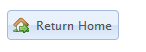
- The project page on CodePlex - IconizedButton - contains a sample Web application that you can download and use to test/sample the control set.
- The following markup gives you the IconizedButton in the screenshot:
<shp:IconizedButton
                    runat="server"
                    id="ibReturnHome"
                    Text="Return Home"
                    ButtonSkin="OfficeBlue"
                    IconPosition="Left"
                    IconType="HouseGo"
                    RoundCorners="true"
                />
Customization
- The following markup gives you the customized IconizedButton in the screenshot (shout out to the troops). Custom styles and images are included in the sample Web application on CodePlex.
<shp:IconizedButton
                    runat="server"
                    id="ibArmyStrong"
                    IconType="Custom"
                    IconPosition="Left"
                    ButtonSkin="Custom"
                    CustomIconType="army-of-one"
                    CustomCssClass="army"
                    Text="Army Strong"
                />

Configuration
Known Issues (and Solutions)
- The button set controls are floated left (float: left). This means that you must clear the float in a container control. Or use a clearfix implementation - my favorite is from Perishable Press
Design (and Performance) Considerations
- Button Skin Sprites - The button skins are image sprites. This helps minimize HTTP traffic and increases server and client performance. For more info, check this link out: CSS Sprites: What They Are, Why They're Cool, and How To Use Them
- Icons are NOT Sprites - I created sprites for the icons categorized by alphabetical groups. While this task was tedious and time consuming, the resulting image files got a bit big for my taste (each sprite ~ 25 KB), so I decides to go with one image file per icon (~600 B). E.g. Lets say you had three iconized button on your page. The IconTypes started with 'A', 'C', and 'S' respectively. Using the sprite implementation, the resource hit would be ~ 75 KB, while using individual icon images, your resource hit would be ~ 1.8 KB. Make sense? A design decision that I didn't take lightly.
- No JavaScript - One of my goals was to have no JavaScript dependencies. Understanding that the .NET Framework will add JavaScript to perform PostBacks, validations, etc..., IconizedButton control set adds no additional JavaScript resources. This also helps when the user/developer wants to customize the buttons an not have to hack around JavaScript dependencies. Just use the buttons (and additional JavaScript) as you would use LinkButton and HyperLink controls.
- Visual Studio Designer - Selecting an IconType will display a default icon for the control. During the IconizedButton control set development, rendering the icon associated with the IconType gave me the infamous Visual Studio design-time delay. The design time delay (the pause in Visual Studio while it retrieves, processes, and renders a resource) is probably my biggest gripe with Visual Studio. I love the IDE; however, this really annoys me. Rendering only a default icon at design-time significantly improves design-time performance.
Credits
- The icons are designed, developed, and licensed by Mark James of FamFamFam. The specific FamFamFam library of icons used in the IconizedButton control set is the Silk Icon set. If you need icons for your application, check out FamFamFam. FamFamFam icons are licensed under the Creative Commons Attribution 3.0 License.
Downloads
1 comment:
hey trydan,
Thanks for creating this control its amazing. Pretty much what i've been looking for.
However i encountered a problem where if an iconized button in a usercontrol is hidden (UserControl.Visible = false), when i do set it to visible = true, the styling is gone, the only thing left is the text. Or maybe i'm doing smt wrong.
Post a Comment